
Relaunch of the airport as a competitive, welcoming, informal and innovative infrastructure thanks to FUD’s effective and intuitive communication design
The airport is changing to provide the people of Friuli Venezia Giulia and their economy
with an efficient modern benchmark facility. It is doing so in partnership with FUD Brand Making Factory. The Lombardini22 brand devoted to Physical Branding and Communication Design has created a co-ordinated visual communication system that will play a significant role in repositioning the airport. Naming, tag line, logo, way finding/signage, choice of colour scheme: the FUD project is based around the place’s identity, focusing on simplifying the passenger experience.
The Friuli Venezia Giulia S.p.A Airport Management Company is looking for a radical change to instil greater meaning and open up new prospects for the facility in both the present and future. The relaunch is actually part of a new industrial plan encompassing major development work on the airport, including important infrastructural works – most notably an intermodal centre and the redeveloping of all the airport buildings.
President Antonio Marano has acknowledged the added value instilled by the Lombardin22 Group capable of coping with every challenge from the concept to the integrated project in various different sectors:
The partnership with FUD turned out to be a winning idea right from the start of the project. This is further confirmed by the fact that we have also commissioned the tried-and-trusted Lombardini22 Group, which FUD belongs to, to design an intermodal centre to be built in 2017. This centre is the linchpin for developing the airport and transport infrastructures in our region to link the airport to the railway network and, more generally speaking, to handle national and international transport in the region.
The FUD project was developed based on a study of the location, its identity and potential. Friuli Venezia Giulia is a borderland where different nations meet and lies at the boundary between the three main ethnic-linguistic groups in continental Europe: Latin, Slavic and Germanic. This means Trieste Airport has its own special and unique identity, whose essential traits have been fully expressed by FUD: smart, territorial, practical and reliable, trans-national, integrated. A people-friendly airport in which concepts and ideals like internationality, simplicity, high-speed connectedness, innovation and tradition all merge together seamlessly. Trieste Airport identifies with these values. This is how it asserts a new way of communicating.
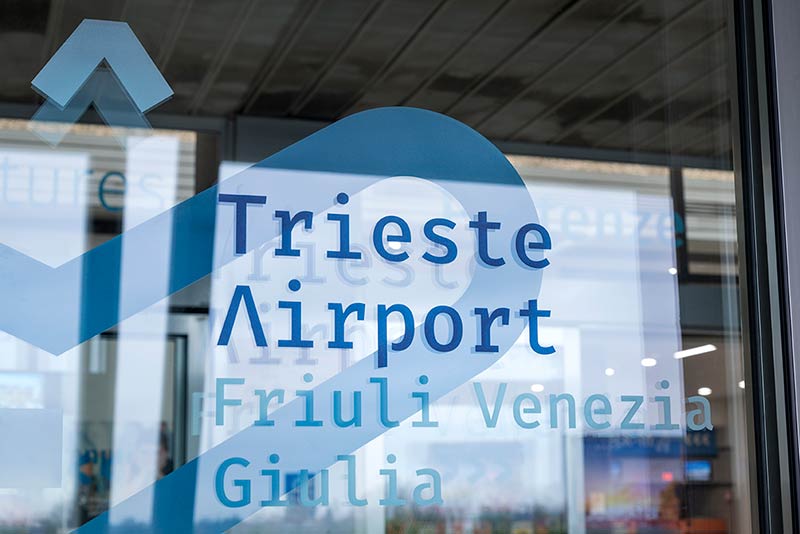
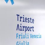
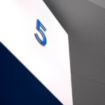
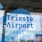
Placing the accent on the territory and international nature of the airport. The choice for the new name perfectly expresses the infrastructure’s new identity. Ronchi dei Legionari Airport will become Trieste Airport, opting to convey its own values primarily by upgrading its own visual communication system in a simple, minimal and comprehensible language.
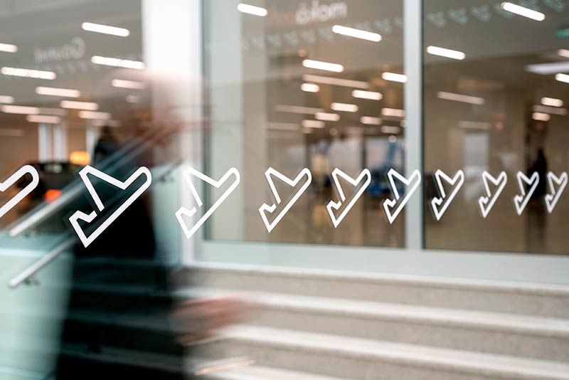
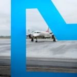
FUD has chosen an accent as the symbol for the new logo: a graphic sign summing up the region’s culture and territorial identity. At the same time this accent, since it is actually a distinctive feature of every alphabet in the world, represents the international nature of the airport, part of that personal experience all travellers take with them on their journeys.
Another key aspect linked with the brand’s values and its identity system is the tagline, a feature capable of enhancing the logo’s distinctive force and recognizability. Nice to fly you is a tagline deriving from the characteristic traits and values of Trieste Airport, encompassing the concepts of smartness and comfort. Drawing on the linguistic internationality of the expression ‘nice to meet you’, a familiar way of introducing oneself, the phrase encompasses the concepts of coming together and connecting.
The name and brand are the very foundations of its identity system. These are the
roots from which a whole paradigm branches out to convey the values represented
in all the brand’s various manifestations: from products and services to settings and
communication projects.
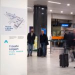
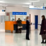
By its very nature an airport is a place full of signs, information and messages.
It is FUD’s task to rationalise and organise the information flow, while also making it pleasant. FUD has created a graphic, symbolic and functional experience no means of a coherent language for the facility’s entire identity, making every feature clear, visible and effective. It is people – in this case passengers – who are the focus of this experience.
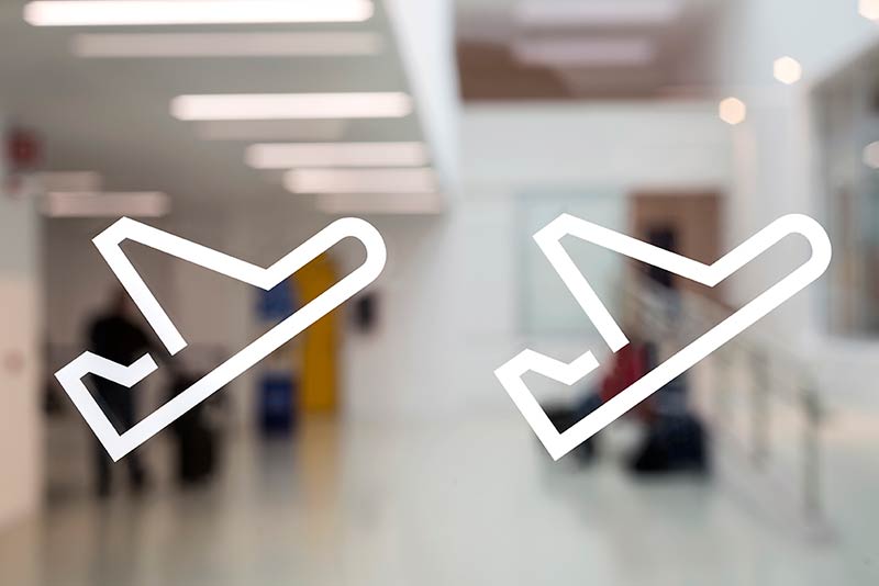
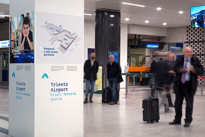
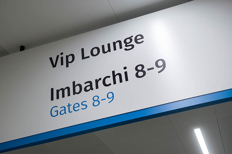
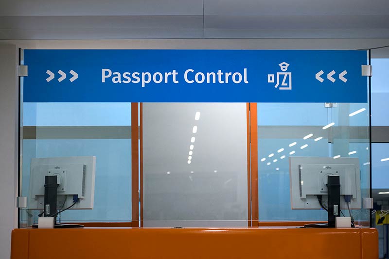
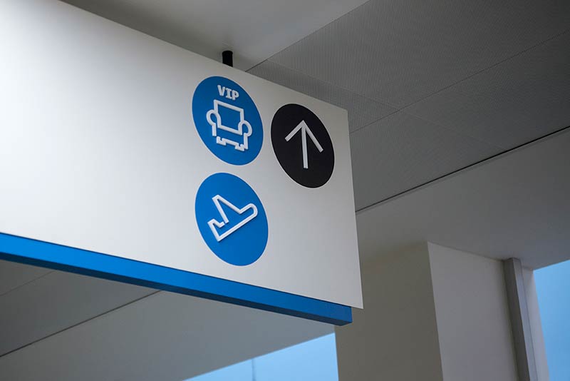
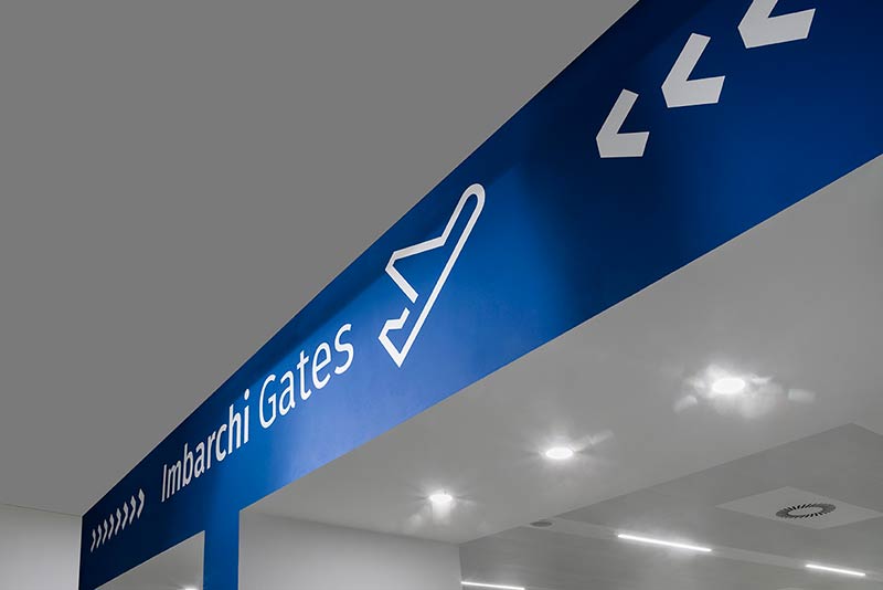
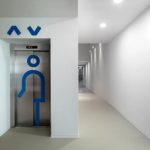
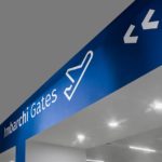
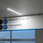
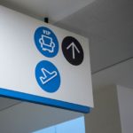
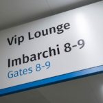
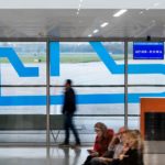
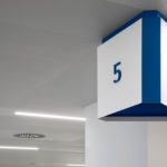
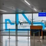
In the passengers’ eyes, the terminology, print, symbolism, formats and colours must always be consistent. The Way finding system is designed to make it easier to move around the place: here the graphics translate a basic service into a universal language, often without using words, something simple and immediately understandable to everybody.
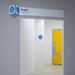
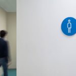
The design of simple and practical way finding tools fitting in with the brand is accompanied by the choice of font – which conforms to the rules of legibility –and a set of custom-designed pictograms based on a universal visual code.
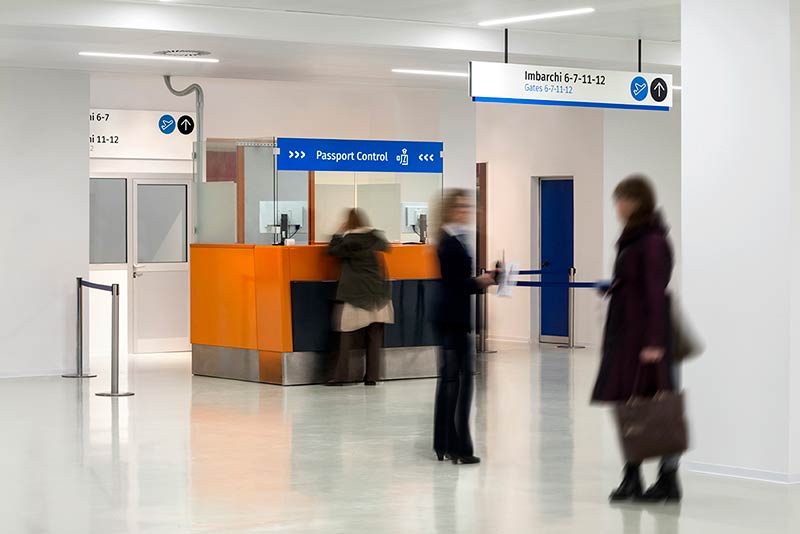
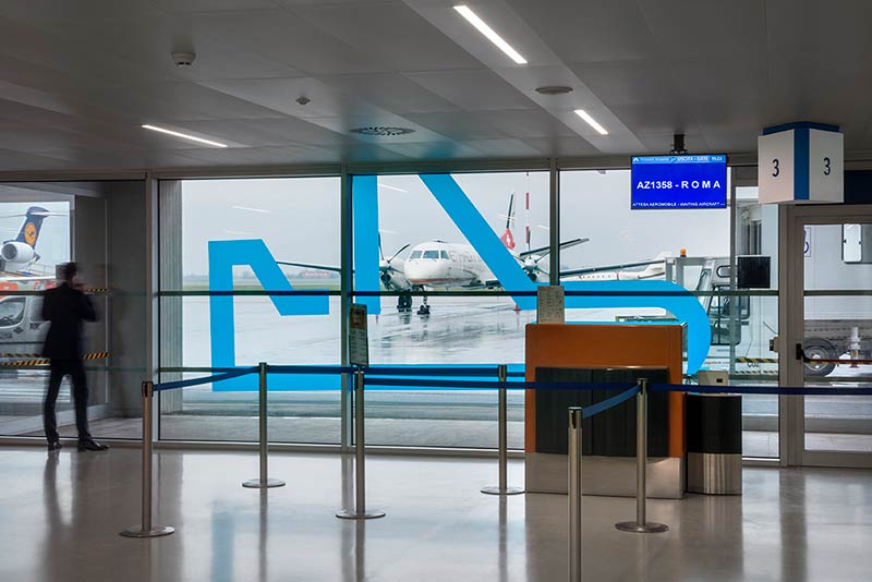
The colour scheme also has an important role to play in the typographic side of the passenger experience. The colours blue and sky-blue have been chosen for the logo, since they are universally acknowledged as expressing diplomacy and elegance and because they represent an ideal vision of the region. This two-tone logo derives from semiotic and functional needs and to distinguish different levels of interpretation, making them more easily recognizable. The colour scheme of the signage is made up of three colours to reduce chromatic confusion to a minimum and enhance legibility. White comes from the architectural setting, so as to be as neutral as possible and contrast with the other colours. The black is actually a very dark grey designed to contrast with the white. Blue, which links together the different colours forming the Trieste Airport logo, lies somewhere between the two non-colours used for the way finding.
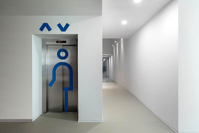
The airport’s new way of being and communicating is designed to improve how the spaces and services are used based on an inclusive “Design for All” approach. FUD’s stylistic-formal choices reflect CRIBA’s (Regional Centre for Information about Environmental Welfare) specific needs: accessibility, usability/exploitability of places to include and engage travellers. For example, the colours chosen for the purposes of inclusive design maintain their brightness whatever the chromatic-visual shortcomings.


comments